Creating the perfect roofing landing page requires experience, testing, and savviness developed over years of digital marketing campaigns.
At Roofing Webmasters, we’ve crafted tens of thousands of landing pages for roofers over the past decade and have collected valuable data regarding landing page performance.
The following post will outline the best qualities of a landing page.

So much of our time in digital marketing is spent trying to sway people in the direction we desire.
Consider the following landing page calls to action, for example:
- Call Now!
- Subscribe to Our Email!
- Get Your Free e-Book!
- Schedule a Free Inspection!
Considering the inescapable volume of advertising and other marketing noise we hear daily, it’s no wonder that most of these calls to action fall on deaf (or overtaxed) ears.
That’s why a well-crafted roofing landing page is so important for cutting through the noise and communicating with would-be clients.
Today, we’ll dig into constructing a winning landing page design (or reoptimizing an existing layout).
Key Takeaway
Landing Pages are Designed to Target a Specific Audience Coming From Specific Marketing Channels.
What is a Roofing Landing Page?
Landing pages are specialized and (often) temporary pages designed for the consumer’s place in the sales funnel. With capable planning, they often enjoy higher conversion rates than traditional website copy.
Of course, their lead-generating power makes them a heavily used tool for advertisers and digital marketing companies.
Best Roofing Landing Page Qualities
Sometimes, a business needs a consumer to see a specific message, service, or offer without the distraction of other website materials.
Many companies achieve this by creating links, ads, and other hyperlinked objects that transport the potential customer to a simple page with a focused message.
That page typically has a header, imagery (or video), short text, a compelling offer, and a call to action.

So, what qualities make a perfect roofing landing page?
Quality #1: It Has a Clear Purpose
It’s easy to jump straight to goal-setting, click-through rates, and higher subscription lists. Try to begin your roofing landing page with a one or two-sentence goal.
Think about what you are trying to get out of this project. Don’t even worry about key performance indicators at the very beginning.
Here are some examples of a landing page vision (or mission):
- “I want to earn more metal roofing sales.”
- “I want to convince more people to come to our business for maintenance work.”
- “I want to generate exposure for a new service I’m offering.”
- “I want people to see our wide list of roofing material options.”
- “I want potential customers to think about our brand more often.”
Decide what you want from your landing page ahead of time. Obviously, it should coincide with your company’s long-term goals.
It should also naturally link to whatever channel your potential clients are using, which leads to our next point.
Google Ads are a Common Origin Point for Landing Page Traffic.
Quality #2: It Fits the Source & Audience
Where is your landing page traffic originating from?
This extends a little beyond the design of the actual roofing landing page, but consider where people are coming from when they land on this special page.
Is your target audience scrolling through their Facebook or Instagram feed when they haphazardly click on an ad? Are they coming from a Google Ad after searching a related term?
As you design your landing page, consider its traffic source(s) and how rushed, interested, and/or familiar the associated audience is with your business.
For people coming from a more casual social media source, you may need to shorten the content, include flashier imagery, and require less information.
Then again, you might take a little more time to discuss an offer if you’re confident your audience is already interested.
Quality #3: It Uses a Compelling Header
What’s the first thing you notice when you enter a website? The logo might be the first thing, but the header likely caught your attention first.
When it comes to landing pages, your header must instantly convey what the page is all about. The best headers focus on the potential client’s benefit, establishing their stake in the future offer.
An Effective Roofing Landing Page Immediately Draws the Eyes to the H1 Header.
A compelling header communicates the main purpose of the page and draws the eye to your offer’s starting point.
From there, your roofing landing page can begin conveying whatever offer and benefits you wish to present to the audience.
Notice how naturally your eyes fall to the lorem ipsum text and the two calls to action.
However, a weak or overly cheesy header can put a bad taste in their mouth, so don’t focus too hard on being clever.
Quality #4: It Stays Focused in the Copy
Landing pages are meant to be short, concise, and to the point. Many businesses make the mistake of overly selling their brand or their services.
While you need to convey exactly what’s included in the offer, effective copy also continues the focus on user benefits. It emphasizes your target audience’s pain points, your role in addressing them, and how they can respond.
Your copy is also the perfect place to connect with each reader personally.
As Hubspot’s Christina Perricone puts it, “Compelling copy also speaks directly to the visitor by using ‘you’ and ‘your’ to make them feel engaged.”
As you or your marketing team writes your roofing landing page, take a moment to empathize with the reader and acknowledge their feelings in the situation.
Finally, wrap all those pain points and desire for relief into a final solution statement that leads to your call to action. Speaking of calls to action…
Quality #5: Its CTA Offer Matches the Effort Required
Have you ever started to fill out a survey (for your local grocer, restaurant, etc.), then quit after realizing it would take 15 minutes?
Carry that same mentality into your design process as you craft the perfect roofing landing page! Whether you decide to ask for a full email form or a simple call, make sure you have a tempting offer waiting on the other end.
Remember this rule of thumb: if the reward is greater than or equal to the effort, then adoption rises.
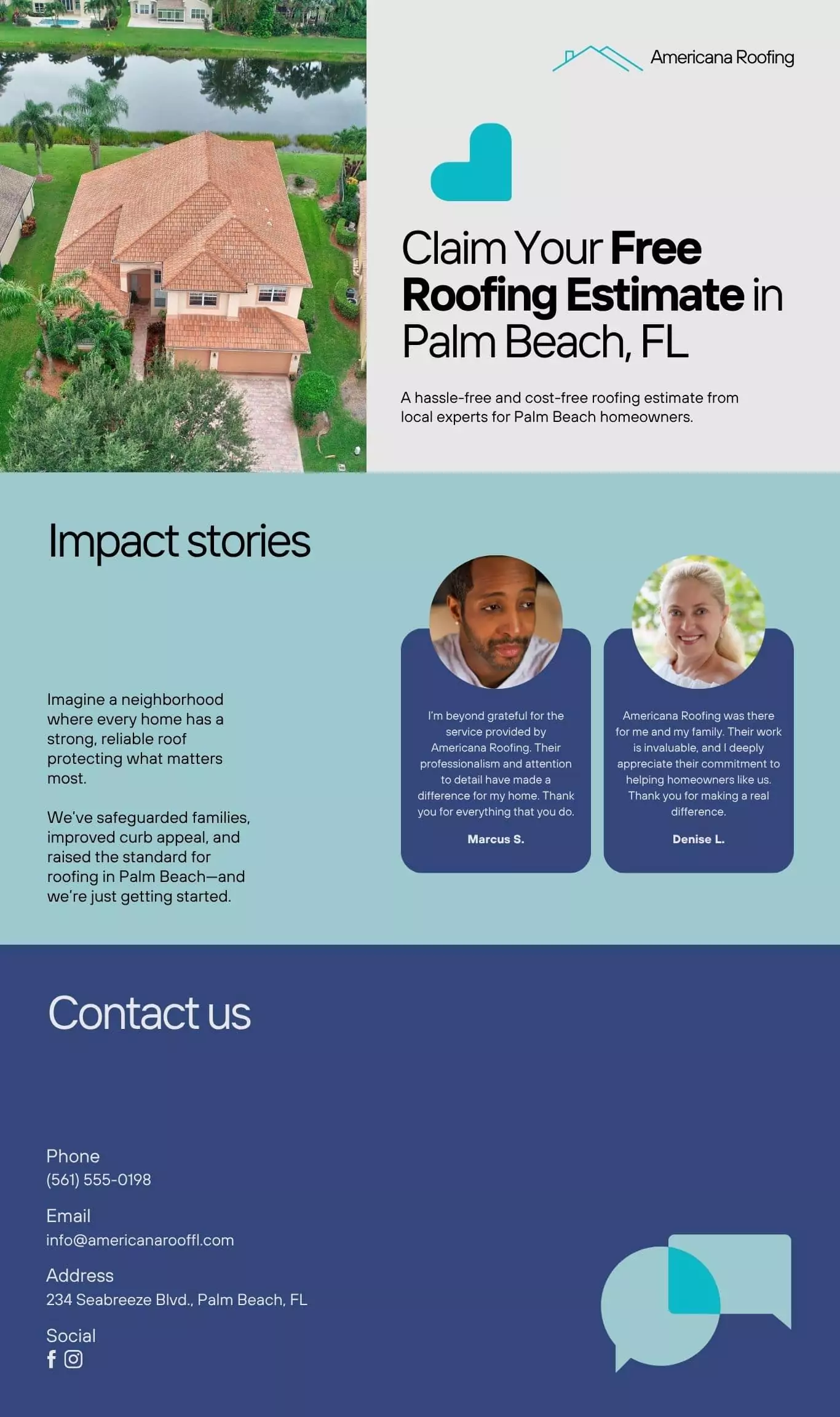
A Free Estimate Offer Involves Very Little Participant Effort, Increasing The Likelihood of Completion.
A free project estimate reduces “friction” because it is available without directly calling the contractor.
An interested homeowner or business can ask for an estimate, and the roofer will get back to them. In return, the contractor receives both the potential client’s number and email.
That’s a win-win scenario for both parties involved!
Quality #6: It Uses an Authoritative Call to Action
You don’t see many landing pages taking a passive stance on your involvement. “Hey, if you feel like it, you can click this button and maybe call our team. You know, if you feel like it.” There’s a good reason for this:
People actually like being told what to do.
It’s true. While many people are naturally wired to resist authority, everyone desires a measure of direction.
Online readers appreciate instructions just as we appreciate highway lane divisions and drive-thru arrows.
Remember, many of the people on your roofing landing page want to be there! Simple directions help them find the relief they need.
A Strong CTA for Roofing Companies Includes Urgency, Clarity, and Direction.
A call to action is most effective when the pain points have been carefully touched on in the preceding copy.
Use the same level of conviction as you link your copy and call to action together.
Your roofing services solve some of the most frustrating situations that homeowners will ever encounter, so don’t be afraid to take authority.
Quality #7: It Incorporates Vivid Images
What your roofing landing page readers feel is just as important as what they learn.
While stirring copy certainly paves the way towards your reading clicking through, you’d be amazed at how much faster images communicate the subject!
Since your landing page readers don’t have time to read 1000 words (as the adage goes), an image is worth even more.
Find Applicable Stimulating Images That Either Touch on Pain Points or the Solution!
Images provide useful tools for creating space around your text blocks and then focusing attention on the call to action.
If you’re torn between two or more high-quality photos, feel free to test them all out and see what works best. The great thing about landing pages is that you can always update and reuse them for future projects!
Quality #8: It Eliminates Distractions
We’ve touched on this a couple of times already, but it’s a point worth dialing down on. Distraction is the enemy of conversion!
If your readers are too busy trying to read through a list of links instead of reading through your offer, the entire purpose of your roofing landing page has been defeated.
Homepages rarely make for fitting landing pages!
A Great Homepage Might Be Too Distracting or All-Encompassing to Serve as a Compelling Roofing Landing Page.
While a well-designed homepage will convert brand searches or even main category searches like “Roofer near me”, it might be too distracting to function as a high-conversion landing page.
Ideally, there should be only one (or a maximum of two) calls to action that are clearly indicated by the surrounding page elements.
For specific PPC queries, a minimalist design that addresses the precise user intent makes a better landing page.
Faded Images Can Support the Call to Action Button Without Distracting From It.
Quality #9: It Changes as Needed
It’s relatively simple to design the perfect roofing landing page. However, goals, audiences, and markets change over time. What works (or doesn’t work) one day can change month to month!
The ideal landing page can be easily adapted to target new audiences and support new marketing channels, so don’t feel overly committed to one particular call to action or image.
Roofing Landing Page Design Services
According to reports, Google Ads alone earned over 264 billion in revenue. Clearly, businesses have faith in the power of advertising.
However, only 33 percent of consumers trust that brands can provide the exceptional customer experience they crave (Exploding Topics).
If your company can learn to better serve potential clients with tailored ads and simplified shopping, you’ll be one step closer to creating the exceptional experience consumers admire so much!
Our team at Roofing Webmasters would love to help you develop deeper client relationships and earn sustained growth for your company.


